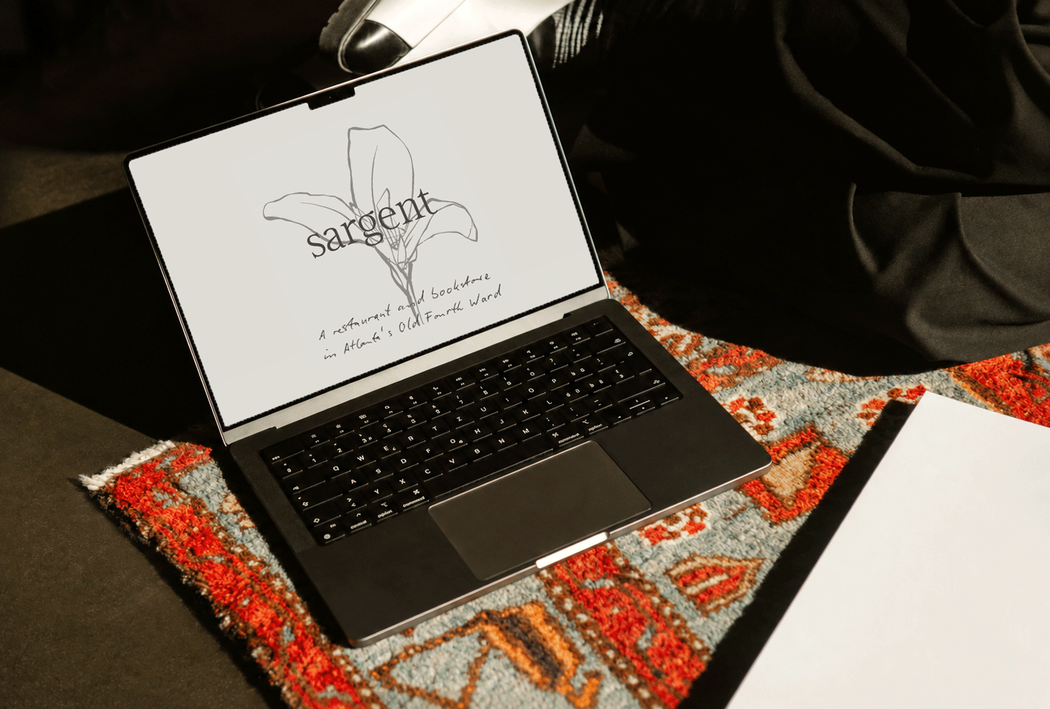
Sargent
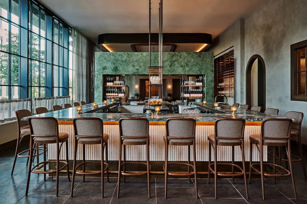
A restaurant and bookstore in Atlanta’s Old Fourth Ward, and the sister to Lucian Books and Wine. Both are a hybrid concept—part bookstore, part restaurant, part wine bar. Shelves of art books and cookbooks sit alongside an extensive wine program.
-
Restaurant + Hospitality
-
Brand identity creation and visual system development
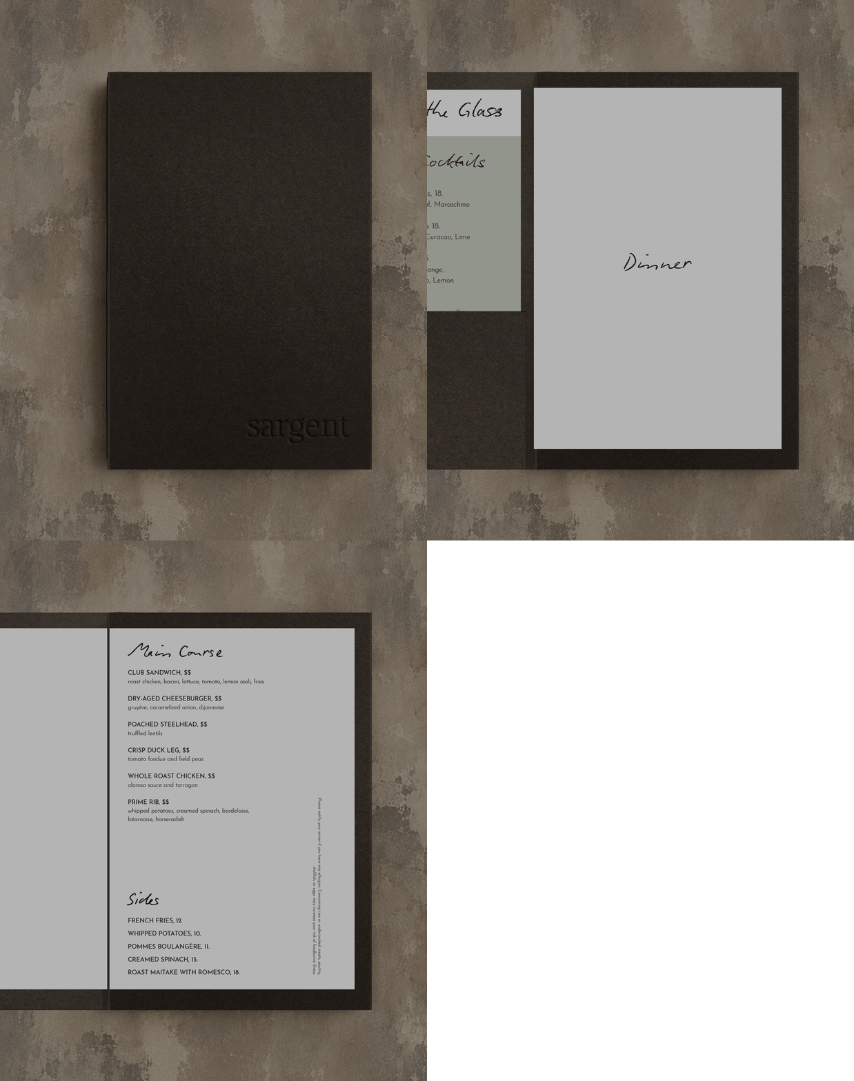
Menu design
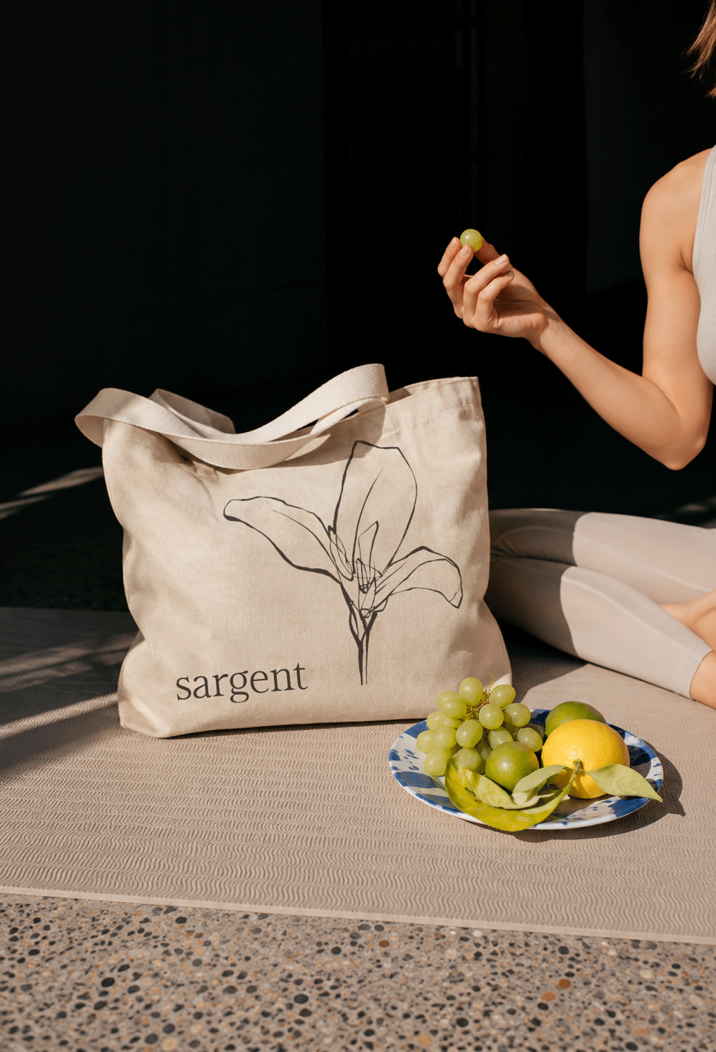
Merchandise and retail collateral
Website design and build
-
2025–Present
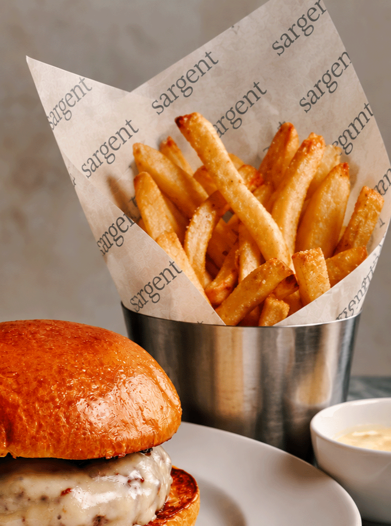
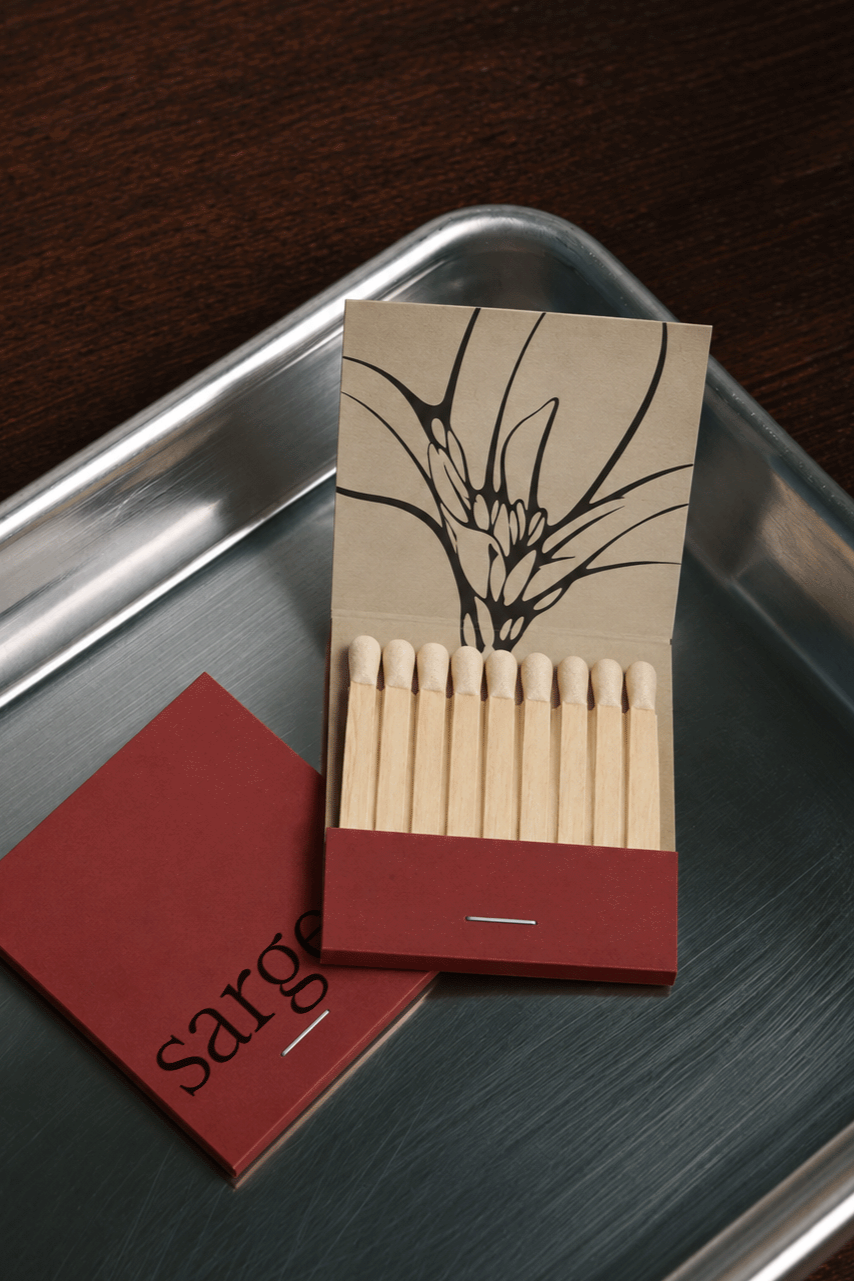
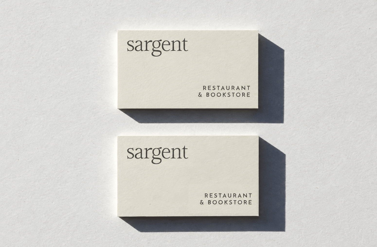
Named for American painter John Singer Sargent, the restaurant's visual identity draws on the artist's expressive work and understated elegance. A refined serif wordmark, muted color palette, and playful floral illustration by Tommy Taylor create a flexible system that feels both established and approachable, reflecting Sargent's character as a neighborhood restaurant and bookstore.

The palette draws on muted, layered tones that feel warm and understated. The identity primarily uses neutrals, creating a foundation, while the remaining colors offer opportunities for future applications.
The wine program features approximately 200 bottles curated by sommelier Jordan Smelt, alongside a selection of classic cocktails. For the wine list cover, we introduced a painterly texture inspired by John Singer Sargent’s work, paired with hand-lettered typography to bring a more personal, tactile quality to the design.
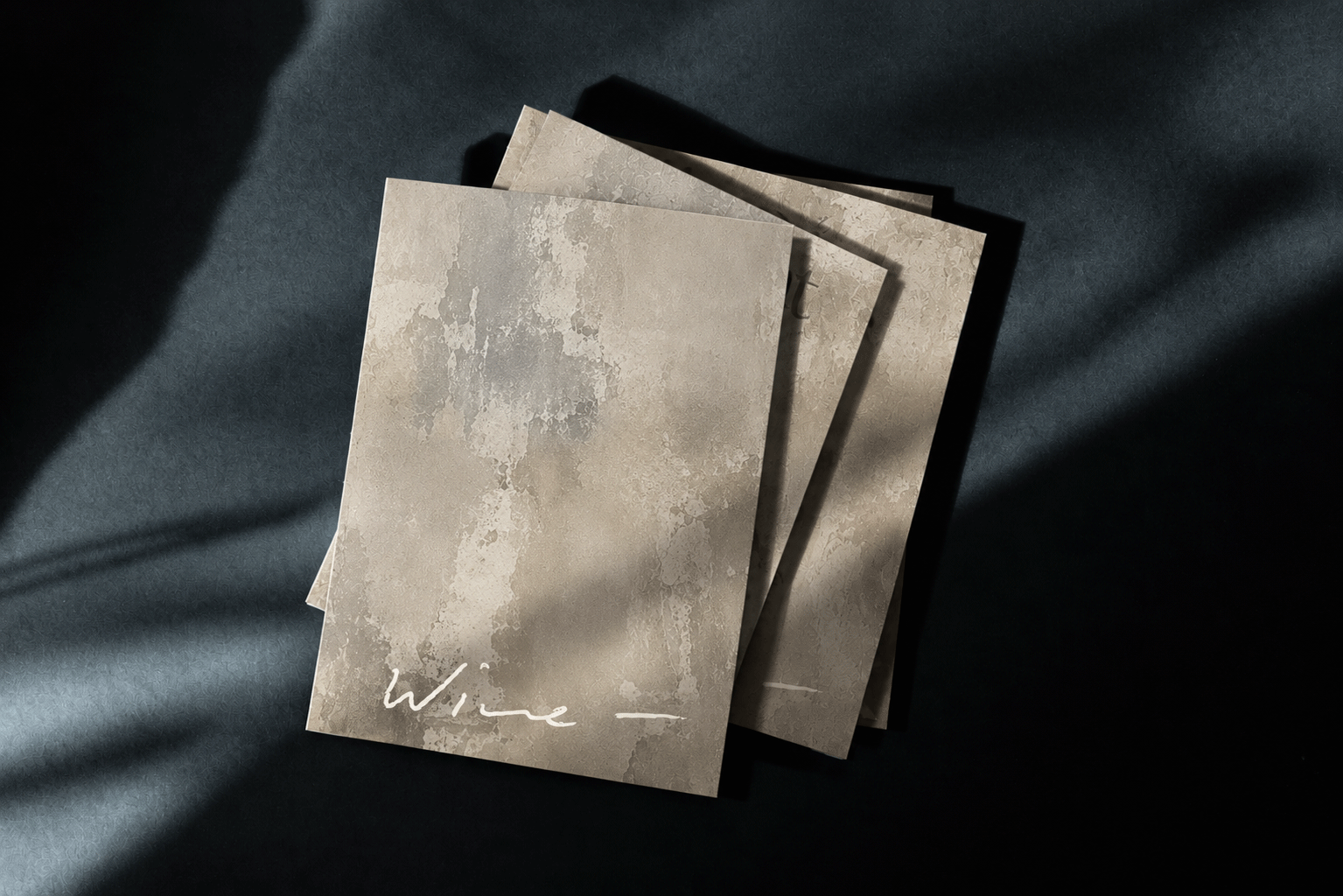
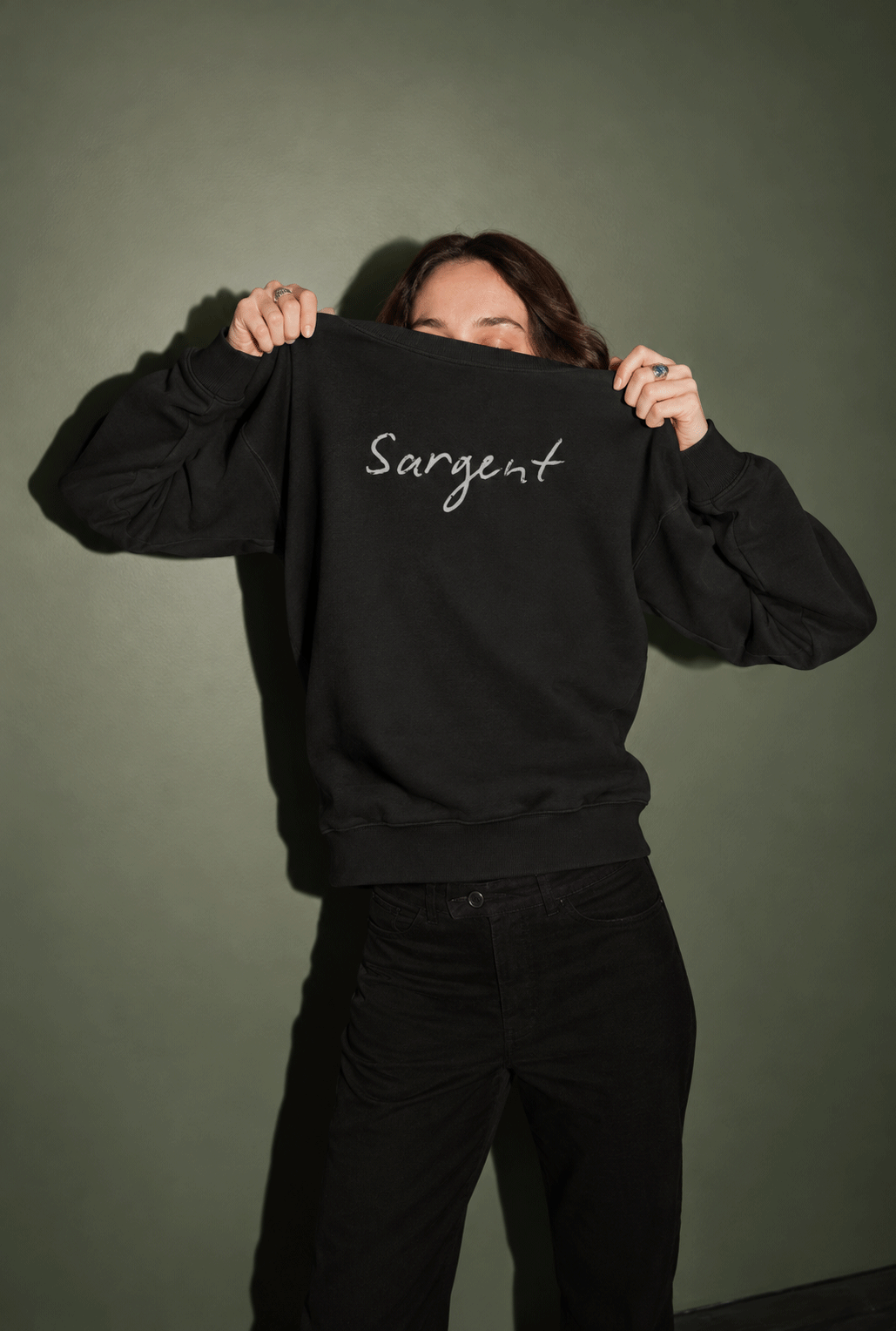

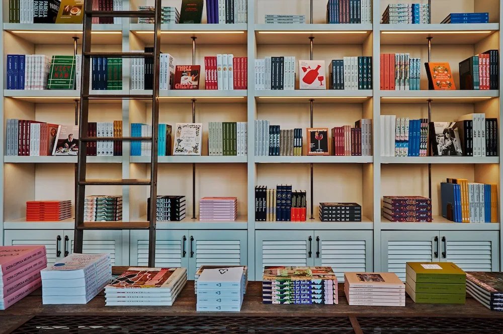
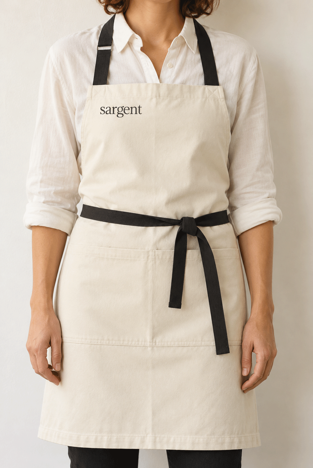
Throughout the restaurant, typography, illustration, painted signage, and carefully considered materials work together to create a cohesive visual experience. The intention was to give Sargent a sense of history and familiarity, complementing the layered interiors and artwork while creating a distinct identity of its own.
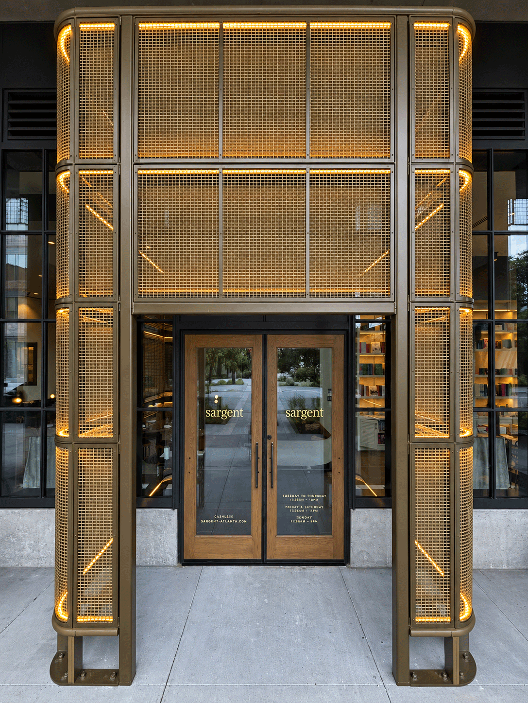
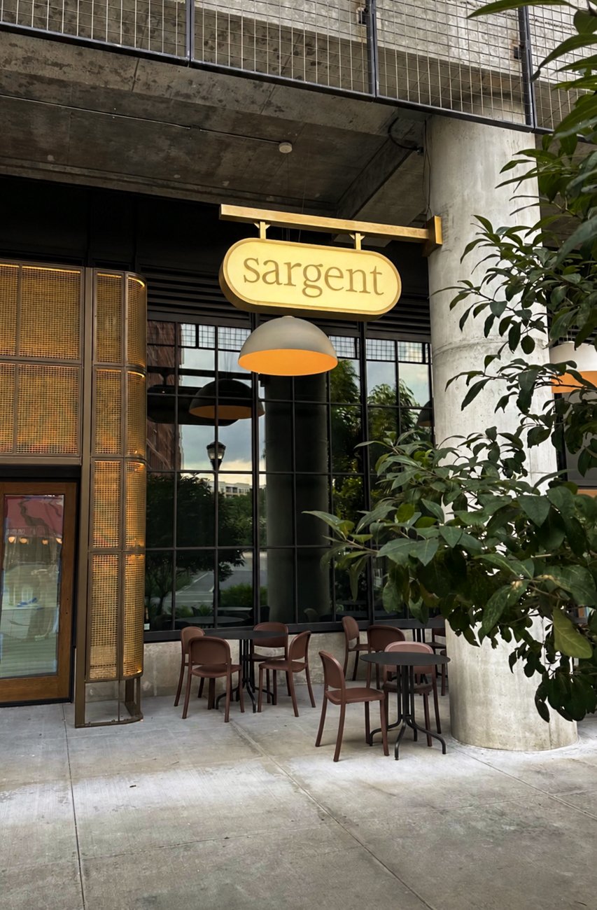
The visual identity extends into the space through a series of painted signs and environmental details. Hand-painted lettering by Adam McNeil of McNeil Signs brings a traditional, crafted quality to the restaurant, while large-scale exterior signage, produced with the help of Denyse and Diggs, establishes a strong presence along the BeltLine.